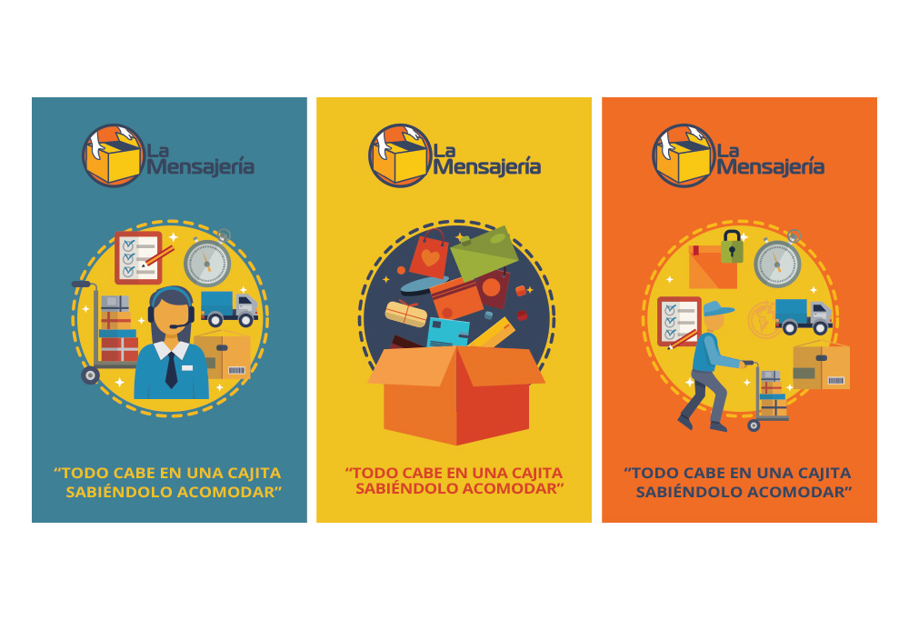
Logistify
Brand strategy, identity, and website
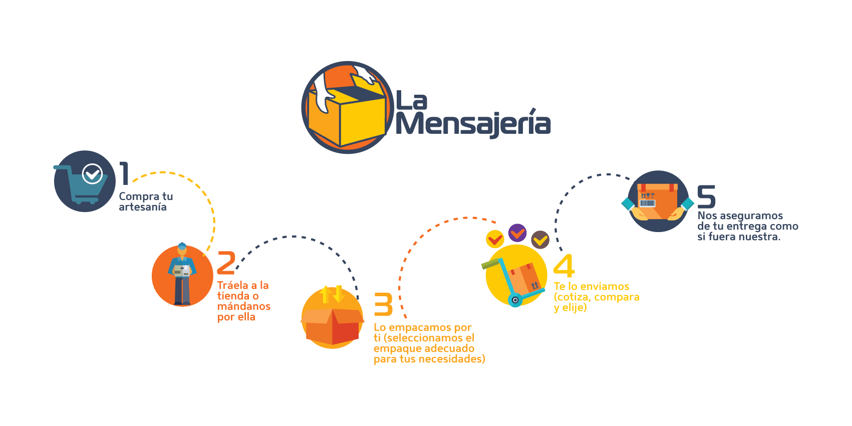
Logistify a logistics solutions provider company. I developed the experience through brand strategy and narrative, identity and logo design, website design, and additional graphics.
The backstory
A dynamic brand identity designed to mirror the services provided by Logistify.
Due to the nature of the logistics networks, they wanted to create an identity that spoke to their expertise but making a friendly image easy to connect with the users. I worked alongside Logistify’s leadership team to abstract their message through the specific use of iconography and language that appeals to potential partners.
The name
Logistify is that their name describes both the company and their product. We knew that the mark must also work double duty, communicating a deep knowledge of logistics operation with a proven methodology for generating solutions to problems in transactional environments.
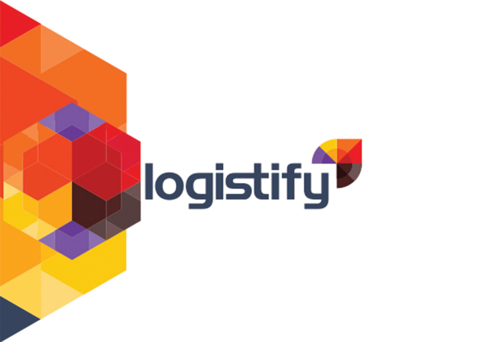
The logo
The logo consists of a memorable arrow that flows with the text. The visual complexity pushes past the traditional motivation for logos to print well, and is instead optimized for a wide range of digital applications.
The logo’s beauty extends beyond its alluring visual composition. They needed a modern identity that communicated the trustworthiness and security.
Logistify’s modularity and power are most easily visualized as a tangible product. The logo’s beauty extends beyond its alluring visual composition.
Tint
A series of bright colors inject life into the brand. Colors ranging from black to deep purple bridge the gap between bright yellow and red. Representing all of Logistify services:
Orange is their standard express delivery service.
Black covers their supply chain services.
Purple is e-commerce services.
Red is freight.
A brand built with empathy
Created through a study in human psychology and self awareness, I developed an identity that connects the digital and physical worlds, and uses intelligent technology to recognize and respond to individuals and experiences.
An arrow-shaped brand mark was an obvious choice, but I wanted to create a logo that was truly distinctive. An iterative process combined design experiments with code tests that explored various ways to represent the complexity of human-like thought processes.
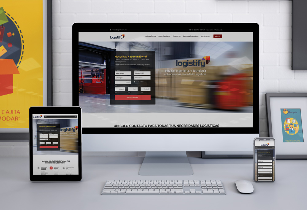
Website Build
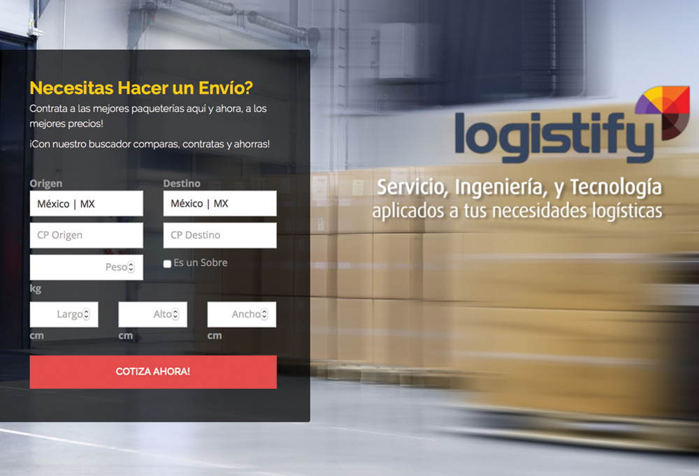
While simultaneously collaborating with a developer I created wireframes and detailed userflows. I took the project requirements and created wireframes and mockups that can be used by the developer.
After dozens of creative exercises and hours pouring over and poking holes in strategy —the result is a scalable, flexible website with a progressive design and highly customized ecommerce system that is as easy for Logistify to manage on the backend as it is for customers to shop on the front.
Wireframes
When Logistify expressed the need for a website that could grow with the business and that truly represented the company as an innovative leader, we went a little overboard. We delivered a comprehensive content block system used within WordPress, which allows the client to easily make sweeping updates to any page without impeding the design or search optimization in the least.
Responsive
Responsive web design allows us to build sites that provide an optimal viewing experience across a wide range of devices—whether you’re on a smartphone or a 27” monitor. It allows easy reading and navigation without the drudgery of resizing, panning, and scrolling or the time and expense of building customized mobile apps for the major platforms.
Task
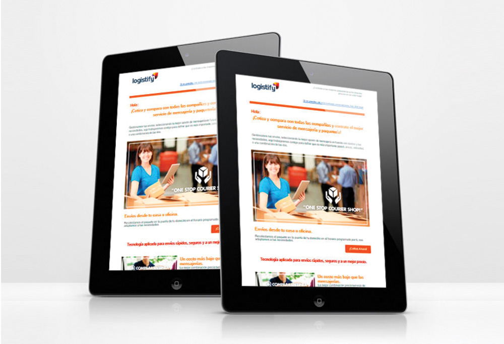
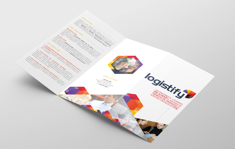
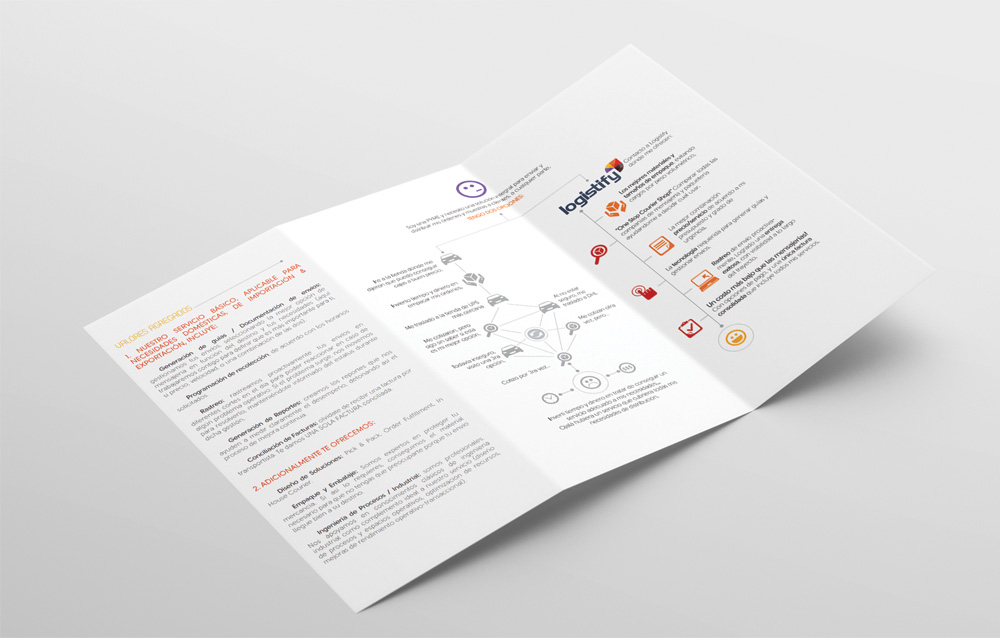
Brand Identity | Brand Voice | Investor Presentations | Website | Newsletter | Trifold
-
Skills
Illustrator, Photoshop, Sketch, Dreamweaver, HTML5 and CSS
-
Client
Logisitify